2021
The client needed a website built that sold their resort experience. This included activities, rates, sights, and a map of the layout. They also needed a logo and colour palette to accompany the website. As their current clientele tends to be in the higher age bracket, it also needed to be as accessible as possible.
Design logo, colour palette, and typography options for the client to review.
Design and build a website that incorporated the branding, remained accessible to their clientele, and sold their retreat experiences.
The client supplied some images as sources of inspiration for where they wanted to take the design of the logo.
I also took a look at some wood carving signs for ideas to help with potential imagery that could be incorporated into the logo.

Insipration Board Samples
I leaned into the wool blanket patterns they gave me and tried a few different approaches. The sketches tried different levels of complexity but something I missed initially was how they would translate to smaller sizes like social media profiles. So while this was a good start, I would need to design a few more versions that removed some text or were structured differently.
4 options were designed with a single colour palette that I tweaked from one of the blanket designs. The green, orange, and yellow helped paint a simple picture of greenery, mountains, and sunshine while coming together in a similar way to the wool blanket references. The different typography options were chosen to either compliment the sharp edges of the logo, like options 2 and 4, or communicate a more laid back environment, like option 1.
Logo Samples
The client really liked the designs of 2 and 3 but preferred the typography of 3. They also liked the colour selection but felt it was a bit too muted. To help them make a final decision, they asked to see both redrawn in vectors with the updated typography, colours, and versions showing full and partial text.
Additionally, their lawyers advised that because the park is zoned for long-term tenancy that the wheels should be removed from the image of the RV and the name of the site be ‘retreat’ instead of ‘resort’.
With those changes implemented, the client landed on option 3. From there, I moved on to creating versions that were suitable for social media and the websites favicon.
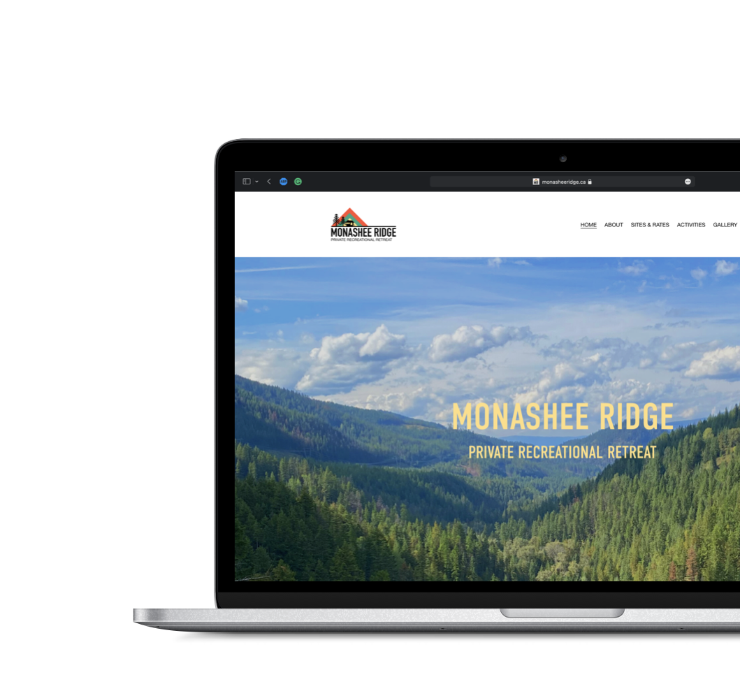
Finally, the palette (specifically the green) and typography were applied to their website. I created some custom imagery for their property map and feature labels and kept the copy size simple and large to ensure readability.
Logo v2 Options
Final Logo Variants
While creating the website, the client asked that we incorporate a map of the property with labels indicating where individual sites would be. They wanted something that matched the brand I created and was as clear as possible.
I was sent a rough sketch of the property and decided to trace over it to get the basic shape down making tweaks to the proportions as needed.
Originally the icons that depicted the sites were going to be little RV images. I later changed them to more simple circles with numbers in them. While the client preferred the RV icons, I made the case that numbers would be much easier to read and make the map look less ‘busy’ to users.
A similar conversation was had around how to label the sites themselves. The client originally wanted the names of each site on the map. Just as with the icon imagery, I pushed back a bit saying that it made more sense to keep the map simple with numbers on the site that correspond to a legend that listed the name. This continued to keep the map clean and readable.

Property Map Iterations

Final Website
Throughout this project, I would say the biggest hurdles involved the property map design. There was a constant back and forth between myself and the client as to what they liked visually more and what I felt was better design for the user. I found that so long as I can position the reasoning behind the design, it was pretty easy to get them on board with my ideas. It also helped that my main contact for this client was a designer so they could more easily understand where I was coming from.
I also found that I could’ve been a bit more forward thinking in my initial logo ideas. There were certainly opportunities to keep social media and minimal text versions in mind during the creation process. Looking back on the designs now, I think it would’ve been much harder to adapt some of them to smaller sizes had they been picked!