2020
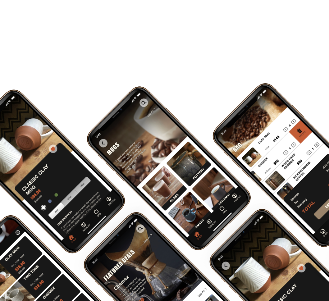
This client needed a simple app that made buying their product as quick and easy as possible. Perfect for users who are usually on the go and need a quick restock of their coffee needs.
Build a mobile application that made purchasing things quick and easy. There should be as few steps as possible between finding what you want and check out.
Build a cohesive brand that sold the experience of the sarcastic, coffee-loving nature of the client.
The client's needs were studied and given to me ahead of this project. The key takeaway was that users wanted a quick and easy way to shop for items on the go.
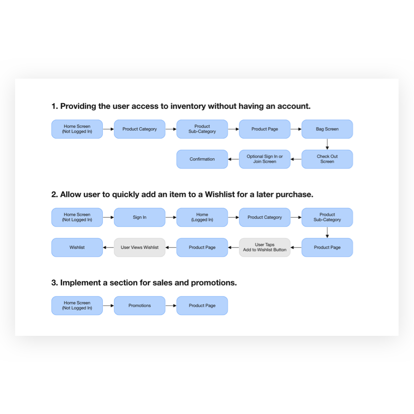
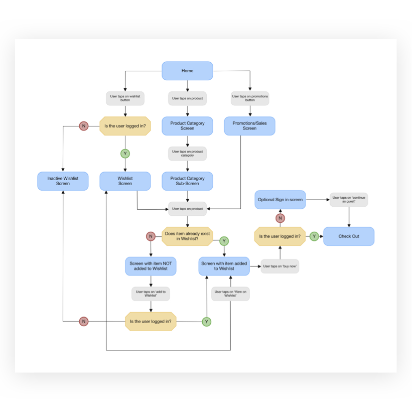
I decided to focus on creating user flows that lowered the barrier of entry for users without an account, have a Wishlist for registered users for a faster repeat checkout, and have sales and promotions front and centre where they can be easily navigated to and browsed.
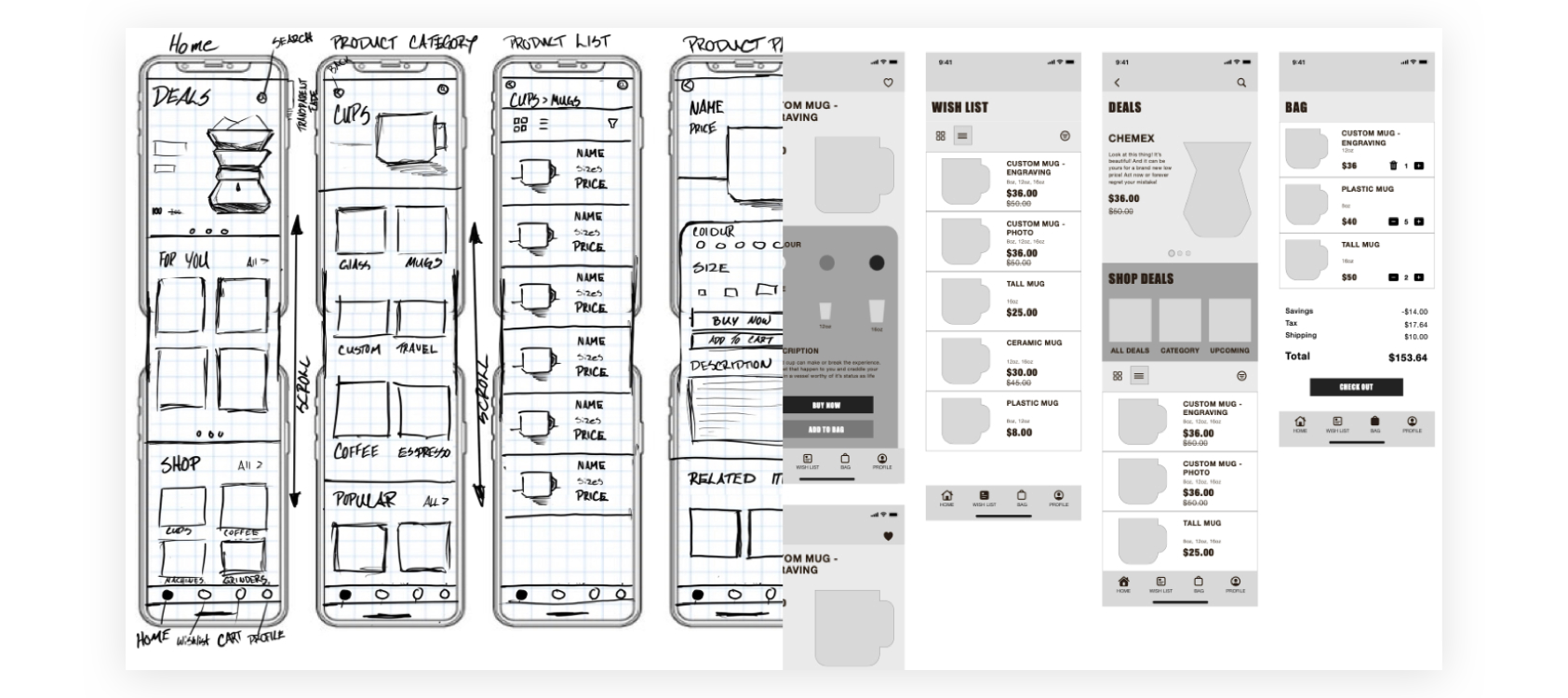
Once I settled on the flows, I started sketching out what the individual screens would look like. I structured the home screen in a way that resembled a customer's retail journey, starting with the large deals section at the top, then something more catered to the user based on previous purchases, and an open shopping section with categories a user could browse.
After the sketches were done, I started preparing some rough wireframes so I could test the flow with users.
I asked a group of 4 users to perform a specific flow tested how easy it was to find something, add it to their Wishlist and then view their bag. I performed one-on-one over video calls using an online prototype created with InVision.

The results showed that while the application was easy enough to navigate, users had a hard time finding the "Add to Wishlist" button. There was also some confusion with the use of the term "Home" on the bottom navigation bar. It didn’t articulate that this is where users would start shopping.
The "Add to Wishlist" button was brought down from the top right of the screen to partially hover on top of the product card. This put it more within the user's line of sight so that it wouldn’t be missed.
The verbiage of the bottom navigation bar was changed to illustrate that the main screen is for "Shopping". Each button now had a clear purpose so the user should always know where to go.
Although this wasn’t mentioned in the user testing, I noticed that the readability of the text was inconsistent when put against the promotional images. I added a slight drop shadow to the copy to made it easier to see and adjusted the positioning of the images to help with this.

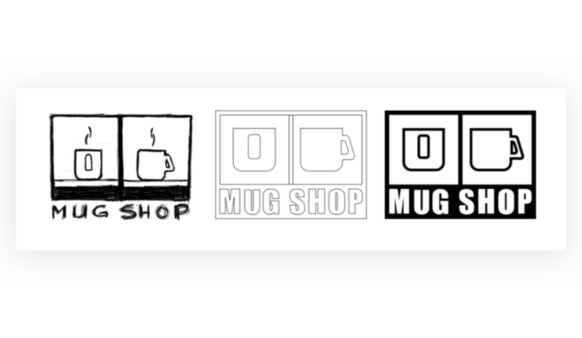
In my mind, the image of this brand was a little snarky and brash, kind of like someone who didn't have their first cup of coffee in the morning. This and the feeling and taste of coffee helped guide my visual design.


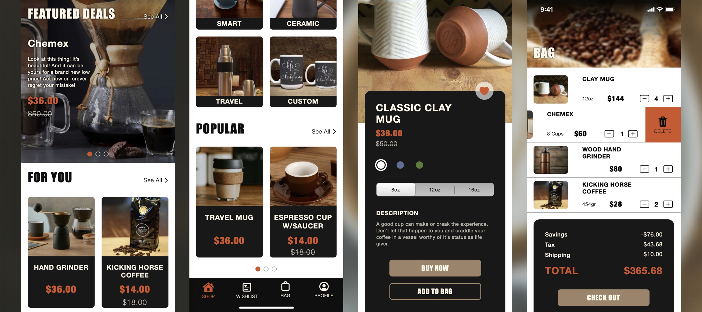
This project started a lot more "bold" in appearance than it ended up being, which is for the best. I took the idea of a cup of coffee further than I should have, imagining it as if the Impact typeface was in charge of the style guide. Including lots of thick black borders around items and lines to separate content ended up creating a design that felt suffocating and intimidating. In the final screens shown here, I scaled a lot of that back, using space to make it less busy and easier to read but keeping the personality.
The feedback around the "Add to Wishlist" button gave me a much better appreciation of button placement. I had overlooked where the user's vision would be on that screen and didn't design accordingly. Just another reason to keep testing things early on!