2021
Okanagan Bike & Ski is a company that provides tours, coaching, and educational services.
Their original website was built by the companies owner to inform their clients about services and pricing. Unfortunately, they kept getting emails from clients asking for information that they could have found on the website.
Redesign the website to make the information clear and readily available to reduce the number of client inquiries.
Create a fresh look that encompassed the companies sporty style and attitude.

Having designed my own website with limited knowledge and skills, I was shocked how awesome the new one turned out to be. I would highly recommend Dan to anyone wanting to optimize their website, brand presence and customer experience. Dan is the Man!!

Emanuela Bandol
Owner/Founder
Okanagan Bike & Ski
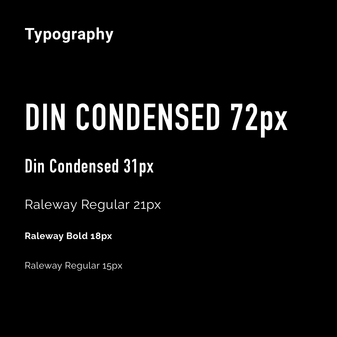
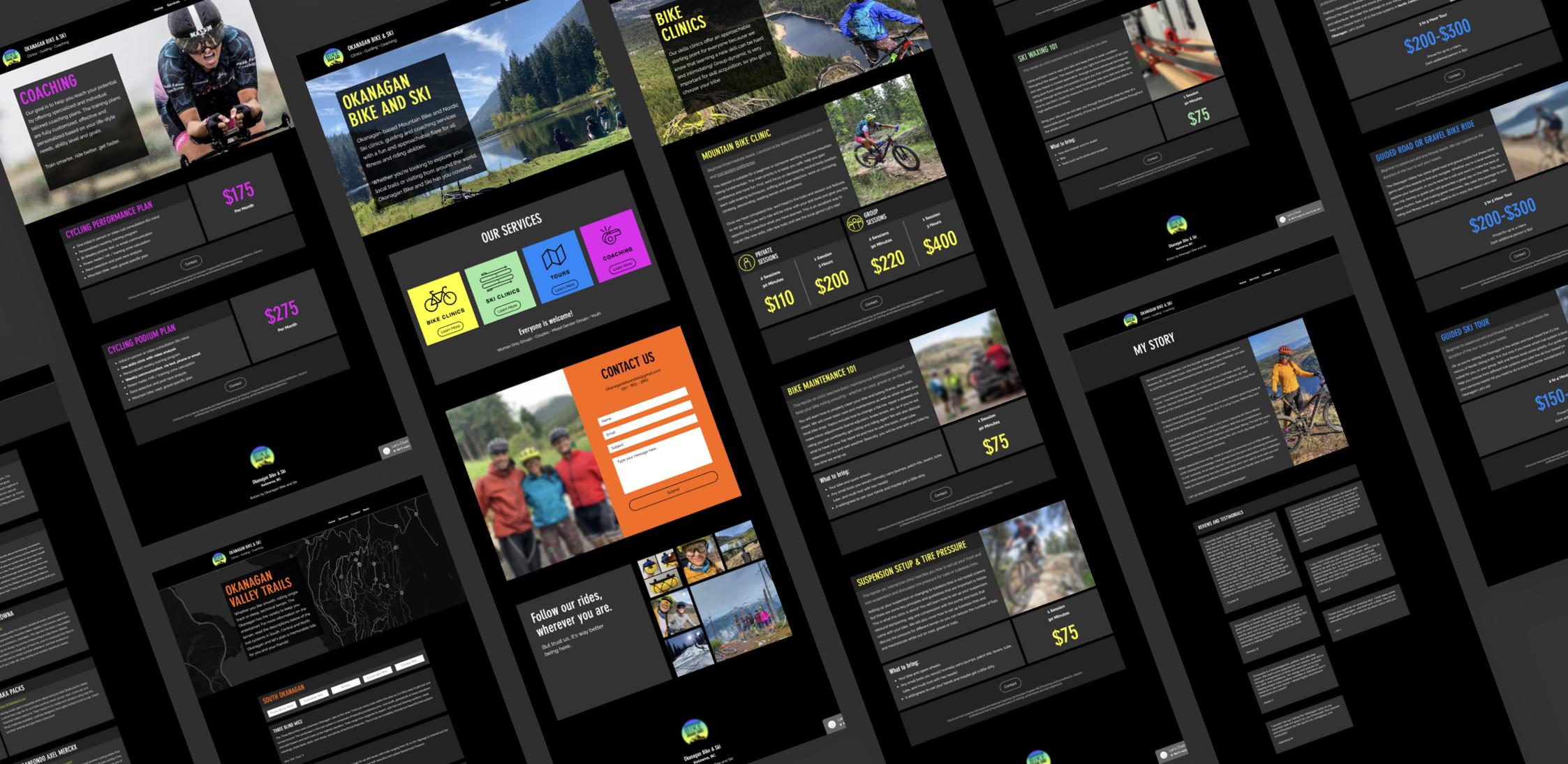
Looking at the existing design, I knew the first thing I wanted to do was address the readability of the information. Clients had struggled to find the information they needed on the site, which resulted in an abundance of emails.
It also didn’t help that there were about 3 different ways to contact the owner. Almost as if they were encouraging people to reach out instead of reading through the content.
I looked to popular fitness apps and brands such as Apple Fitness+, Nike, and Adidas for design inspiration.
The use of boxy designs seen on Nike and Adidas helped inform a design that the client could easily copy and paste as they scale their business.
Original Design

Inspiration from the clients logo, Nike, Apple, and Adidas
It was important from a content and structure perspective to keep things simple for both readability reasons, and so that the client had an easier time adding content as they grew.
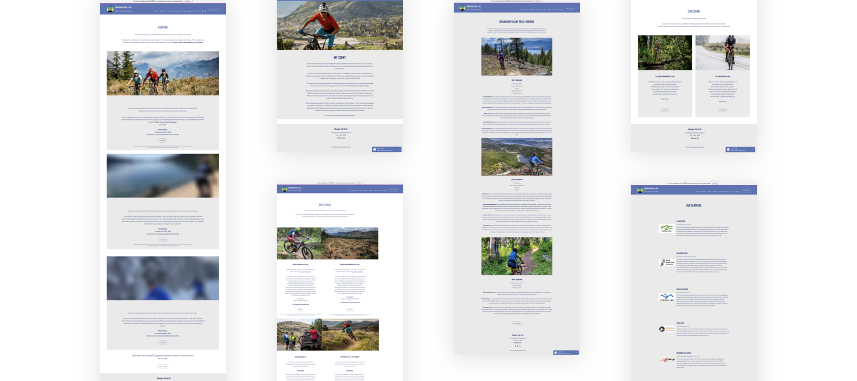
The client had a lot of high quality photography, it was important to showcase these, to demonstrate, and to subsequently sell the full experience.
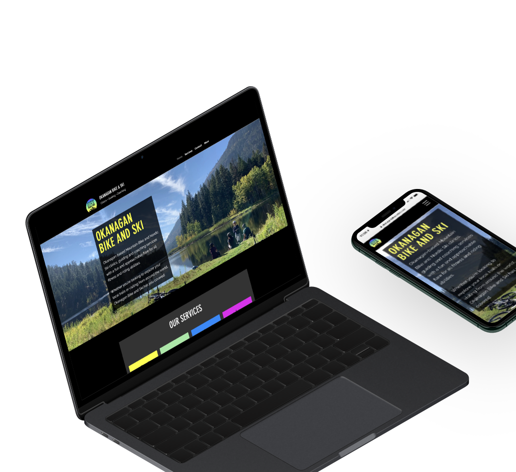
The home screen would have clear buttons peaking just above the fold that directed users to the individual services. The contact button at the top is anchored to the relevant section on the same page to encourage the user to scroll more often.
The services page would use a similar layout and be presented as boxed items instead of side-by-side columns. Any service with multiple pricing tiers would have its own clear subsection within the box.
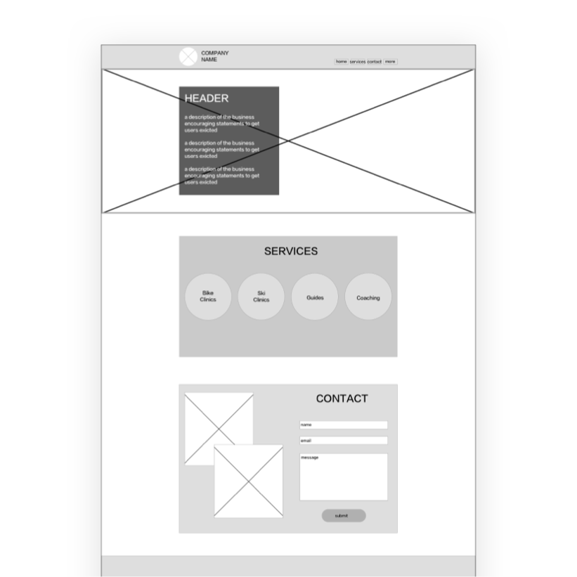
Home Screen Wireframe
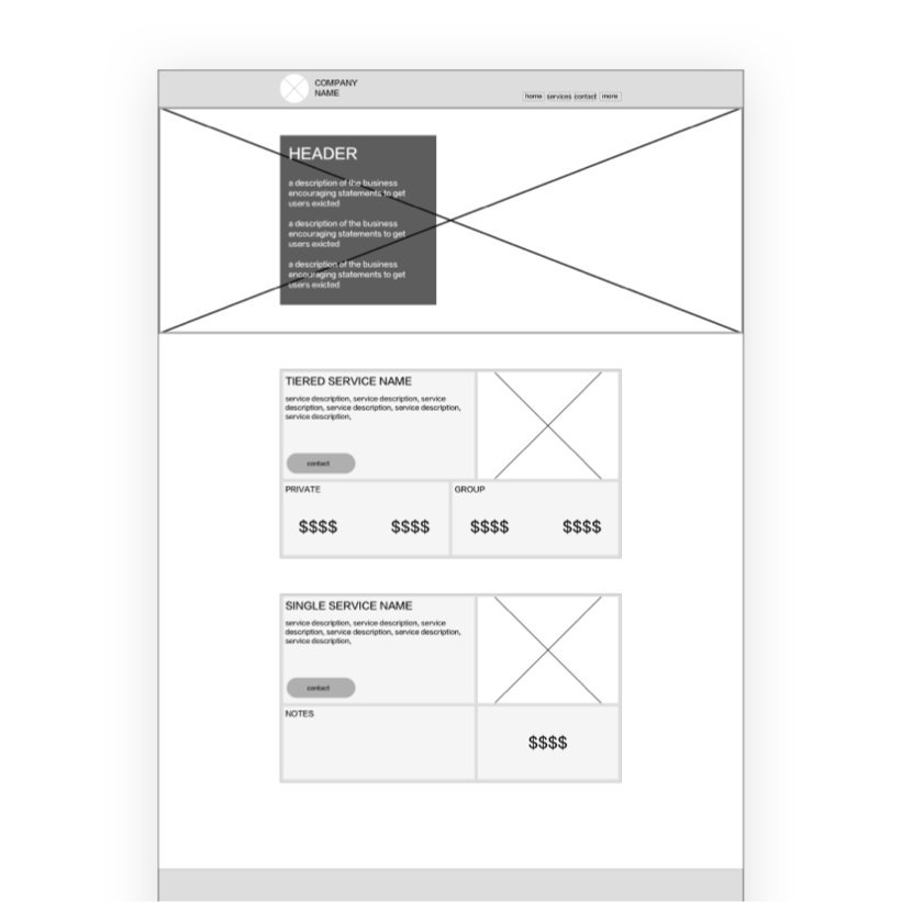
Services Screen Wireframe
The client already had a logo and wanted to keep it as is. My goal was to design the rest of the brand using it as my source of inspiration.


This was a lot of fun to work on! I had a few calls with the client during the project where I went over my design changes and the philosophy behind them so they felt comfortable enough maintaining it when I was done. While my primary task was to create a functional design they loved, I also wanted to empower them with the knowledge to maintain it as they grew.
One of the biggest challenges was the Guided Tours section of the website. I wanted to create a map that contained the trails and highlight them as the user scrolled down. I thought this would be a slick way of adding some context but it ended up being far too time-consuming to do if it was even possible at all. While I wasn't able to incorporate this into the final design, it was a valuable lesson in choosing function over form.