2021
Orgmatch is a new company that was in need of consistent branding to better communicate their idea to investors. They wanted something that stayed professional yet approachable and incorporated their initial idea of satellites and space imagery.
Design multiple logo, colour palette, and typography variants.
Deliver a design document that illustrated how their final design should be used.
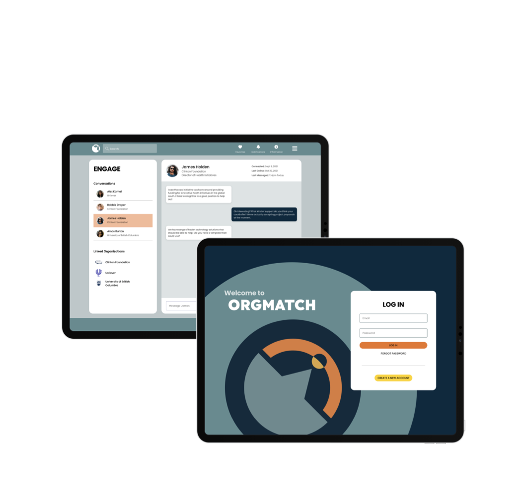
Apply the design to their v1 wireframes to help them in their investor presentations.

It was a pleasure working with Dan through the Orgmatch branding process. Dan got us to a place where we had clear brand guidelines, logos, typefaces, colouring, and an upgraded UI/UX interface.

Trevor Loke
Owner/Co-Founder
Orgmatch Inc.
The client was inspired by space and wanted to incorporate circles and satellites which represented their value prop of finding and matching with other organizations.
I decided that I would use that space theme as the foundation of my research. I looked at art and imagery ranging from retro to hyper modern and neon styles of space.

Insipration Board Samples
The client wanted to keep the design 'more fun than Linkedin' but still professional so I took that and created a few colour palettes based on the imagery I researched. I made sure to consider what a light and dark mode would be at this stage so the client could adjust this themselves without much more effort.
To accompany the swatches, I designed a basic wireframe based on one of the clients existing Figma screens to further illustrate how the colours would interact with each other.

Palette Samples
For the logo, I focused on incorporating a satelitte, as this was their original logo. Some designs are more subtle than others in executing that idea using circles orbiting instead of outright images.
I wanted to make sure that they were easy to read in a variety of sizes and that they were as unique as possible. This would help the brand stand out.
Logo Sketches
I looked for typography options that included very circular characters and a single-storey ‘g’. The single-storey ‘g’ comes off as more fun compared to the double-storey while still staying professional and very readable. The circular characters worked well with the idea of space both because some of the logo options heavily utilized perfect circles and I liked the idea of them being like little planets hidden in the text.
As a fun alternative to the Titillium typeface, I tried Rubik. Rubik is consistent in it’s lines but has a slight bezel to character corners which comes off friendlier and more professional than Titillium while still keeping the single-storey ‘g’.
Ultimately, I felt that the fun factor didn't necessarily need to come from the style of the typography. It can stay clean and professional and we could use colour and gradients to inject the vibe we’re looking for.

Typography Examples
The clients narrowed their choices down to two logo and palette options. They really liked the idea of having the typography incorporate more circular characters and it wasn't even something they had originally thought of doing.
I prepared vector assets for both logo options and presented each in a few different ways that incorporated the two colour palette choices.
The palette options were refined and applied to a higher fidelity mockup screen to give the client a clear idea of how it could look in a final product.
Logo v2 Options

Refined Palette Options
In the end, they landed on the simple but thick circular logo that incorporated a satellite, the letter 'O' and the angles of the letter 'M'. They liked it for it's unique look and how versatile it could be.
For the colour palette, they went with the more 'retro' blue-green and orange option. Many social platforms use blue for it's comforting and professional feel and this accomplished a similar vibe while still being able to stand out.

Final Design Document
I really enjoyed working with this client because they trusted in my design decisions and thought processes. That being said, I could have been more assertive with my opinions and presented fewer and more focused options eariler.
There were meetings where the decision makers were split on their choices and it fell to me to almost be a tie breaker. Once I had articulated my opinion, it seemed like it was easier for them to land on a single idea.
Next time, I would strive to articulate the thought processes earlier and be more agressive in my idea screening process.