2020
I built this for myself. As an artist, I’ve used many apps for anatomical reference while I draw and never landed on one that I loved. They usually feel hard to use and are overly complex.
Disclaimer: All images of the 3D models used in my UI mockups are exported from the ArtPose iOS app.
Design 2 versions of the same application with the same feature sets that felt like a native app on their respective mobile OS’.
Keep the design simple and clean so that the focus is always on the pose itself and not the plethora of customizations.
I started with a competitive analysis of 3 apps that I used while drawing. They all focus on providing anatomical reference and have varying degrees of complexity.
On the plus side, models were large and detailed, it was easy to browse between them, and there were lots of extra features to customize the scene.
Yet, the large models and number of customizations also created a more complex looking UI that had to be very small to fit on the screen. This made the apps hard to use. The worst offender had buttons behind the phone's camera, making them completely unusable.

Competitve Analysis
Having reviewed the competitors, I decided to keep my feature list short. Focusing on fewer options would allow the UI to be more manageable and out of the way.
I wanted the wireframes to follow the Apple and Google Design documents. This let me focus on the user experience which was the primary goal.
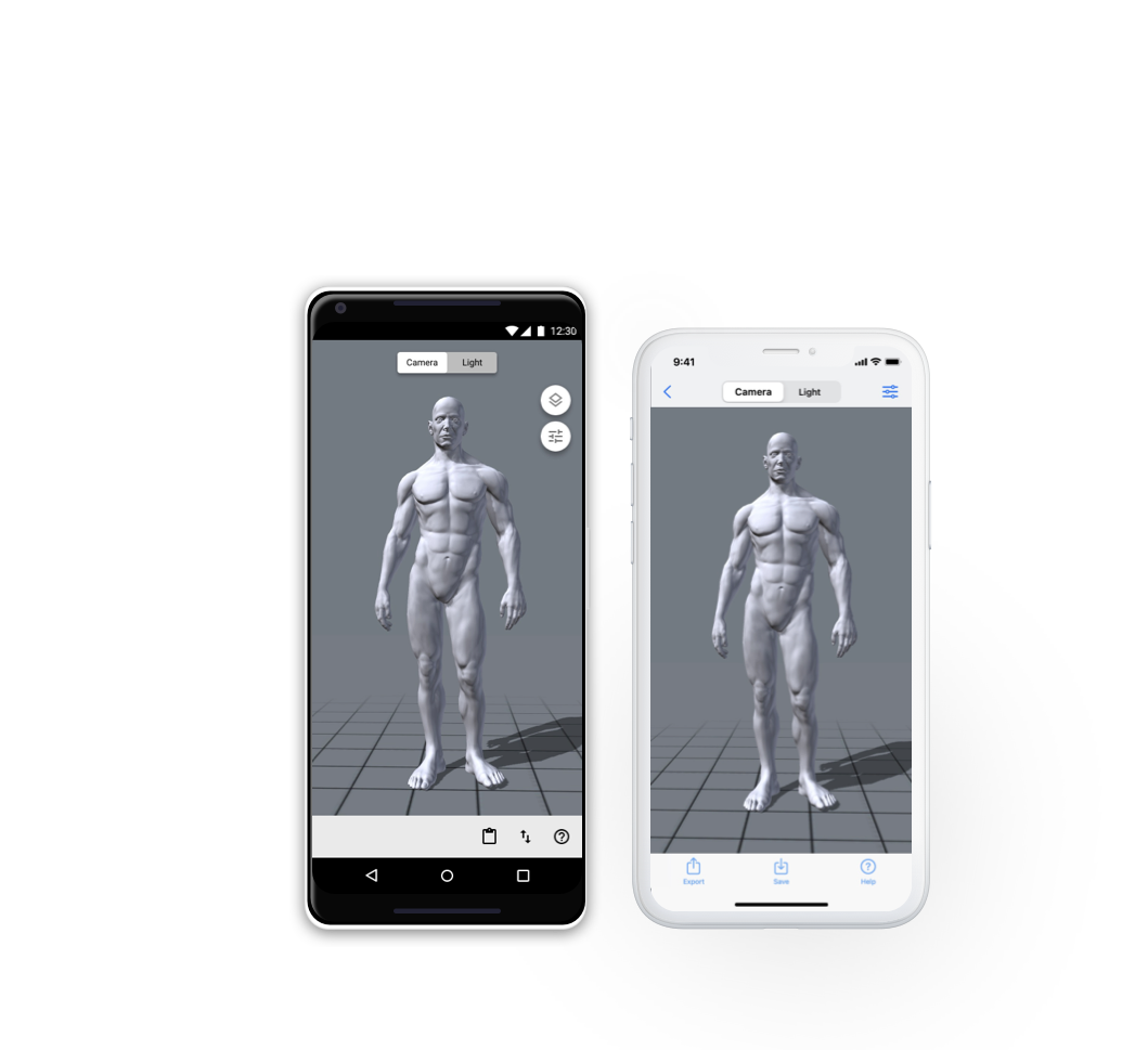
I decided to split the UI in half, one for camera and model control and the other for lighting control. They would be controlled by a toggle and contextual elements would appear when switching between the two.
Gestures would also change depending on what mode the user was in. In the camera mode, gestures would adjust where the camera was. In the light mode, gestures would control the position of the light source.

Camera Mode concept

Light Mode concept
For my testing, I split a group in two, one for iOS and the other for Android. Both groups were comfortable using the relevant OS so they could tell if I had nailed the feel of a native application.
Users were not responding well to the way the UI tried to present contextual options. Buttons appearing and disappearing was jarring and confusing and there were too many taps to do a simple task like going back to the main screen. The symbols on the buttons also weren’t clear.

iOS User Feedback

Android User Feedback
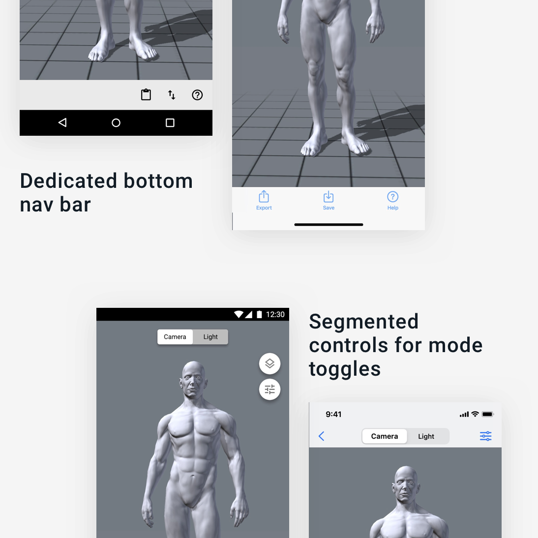
I needed to rethink how I presented the camera/light toggle. While looking for inspiration, I adopted the method that iOS uses in the Phone app when sorting between All and Missed calls. The segmented control bar was far more recognizable than my initial design and I didn't have to rely on imagery. On Android, they had no such control that I could use, so I designed one myself that still looked like it belonged.
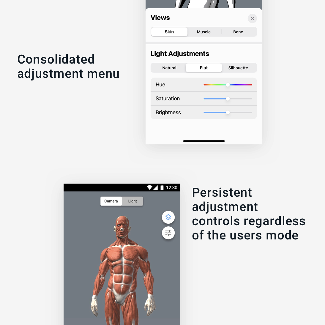
I removed the contextual buttons and consolidated their relevant toggles into one menu. This created fewer disappearing buttons and reduced confusion.
I also took some inspiration from Google Maps with the Android version to make it feel more consistent with Material's design.

My initial attempts to make the design as minimal as possible backfired on me. Nobody understood how the toggles worked and why buttons were disappearing. Once I was able to walk them through the process, it made sense to them, but that shouldn’t be expected of a UI.
Testing the design early on helped me realize that I can't take user behaviour for granted. Assuming that someone will figure something out because I know how to do it isn't safe.
I played it pretty safe with the design language of the operating systems here. This application looks like a tool and doesn't have much in the way of a personality. This was the right choice, though. It isn't meant to make a statement, the focus is the pose.