2021
Sundown Brewing is a Beer company based out of Vancouver, BC.
As the company grew over the years, the style guides used for their branding, website, and beer cans became out of sync. The website they had built on Squarespace was also an expense that they wanted to cut as they could host it themselves.
Build a single, responsive landing page that communicated the client's values, contact options, and updates to their customers while also unifying their disparate branding.

Surprised and delighted us with all the small personal touches that made our site look and feel professional, yet unique. We’re in awe with the final product and can’t wait to work and collaborate with him again.

Kevin Garneau
Owner/Co-Founder
Sundown Brewing Company

The previous website was built using a template at the start of the companies journey and didn’t appear to have been updated since. New information such as the awards they’ve won was nonexistent and while it had design queues from their initial brand guide, it didn’t show off where they are now.
When comparing the original style guide to the current beer can designs, there are some striking differences.
A challenge for this project was going to be unifying both styles cohesively.
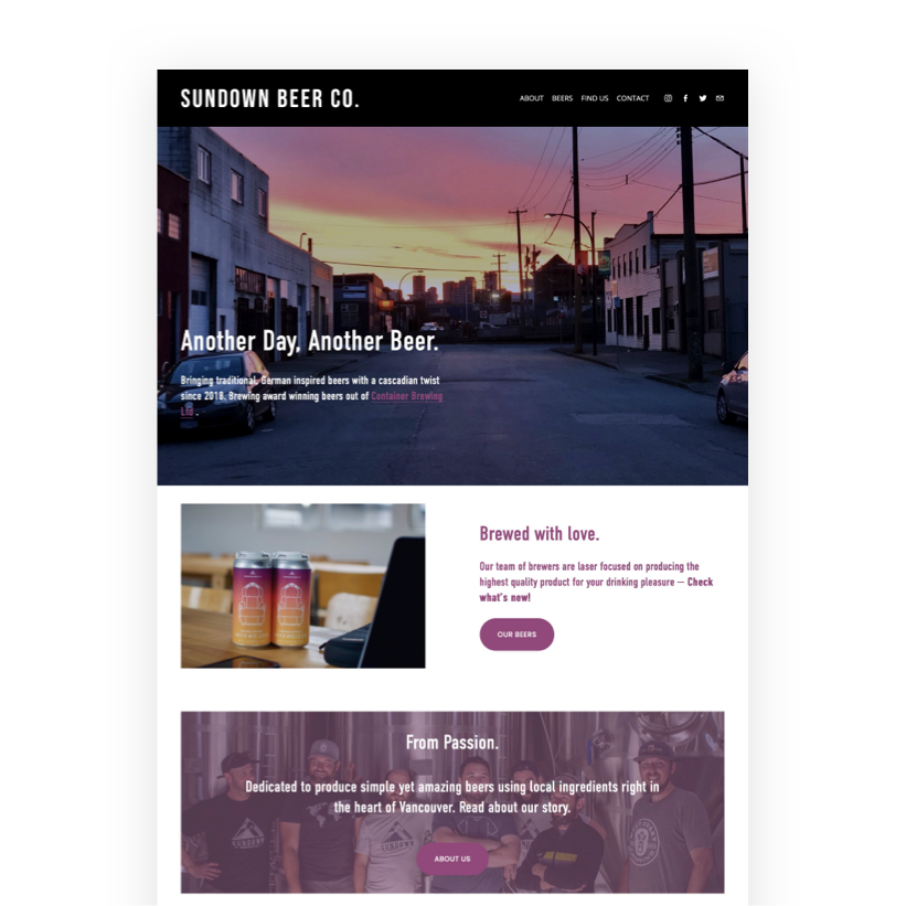
The original website
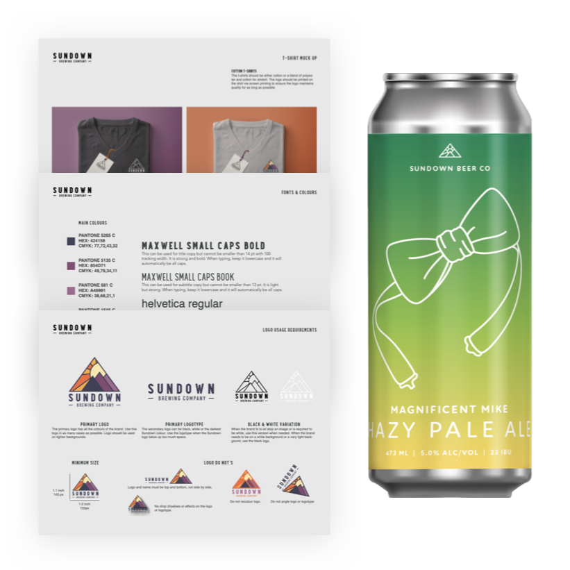
The original style guide and current product label

The clients were undecided on direction, to facilitate a decision I produced and we reviewed several different design directions.
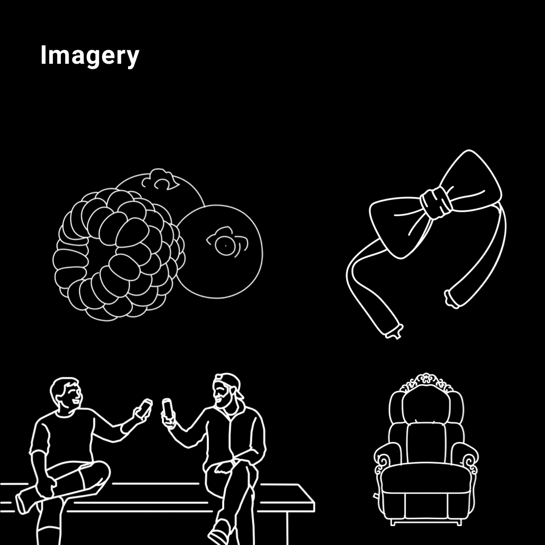
I started with designs that used colour sparingly to ones that had it more front and centre and always made sure to include the beautiful line art that they use for their can labels. The gradient I created used the palette from their first style guide which helped bridge the two styles together.
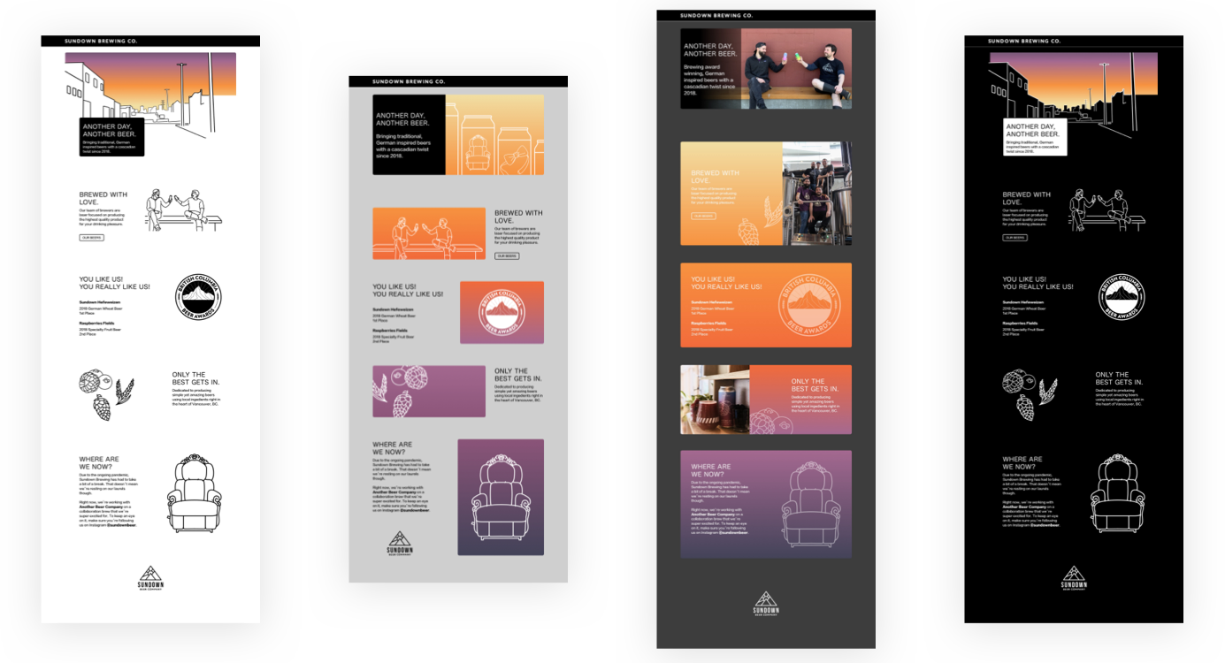
Mockups that combined different aspects from both their previous style guide and current product labels
The client liked the designs that used only the line art but still wanted to incorporate more colour like their can labels. The idea was to use the gradient I made from the original palette across the entire page. I was hesitant with this path as I wanted to ensure that the information remained legible. That would be tricky given that the background would be different everywhere.
I started experimenting with the spacing of the gradient mix, trying to ensure that colours start and end within specific areas and then tweaking the hues to keep the text clear.
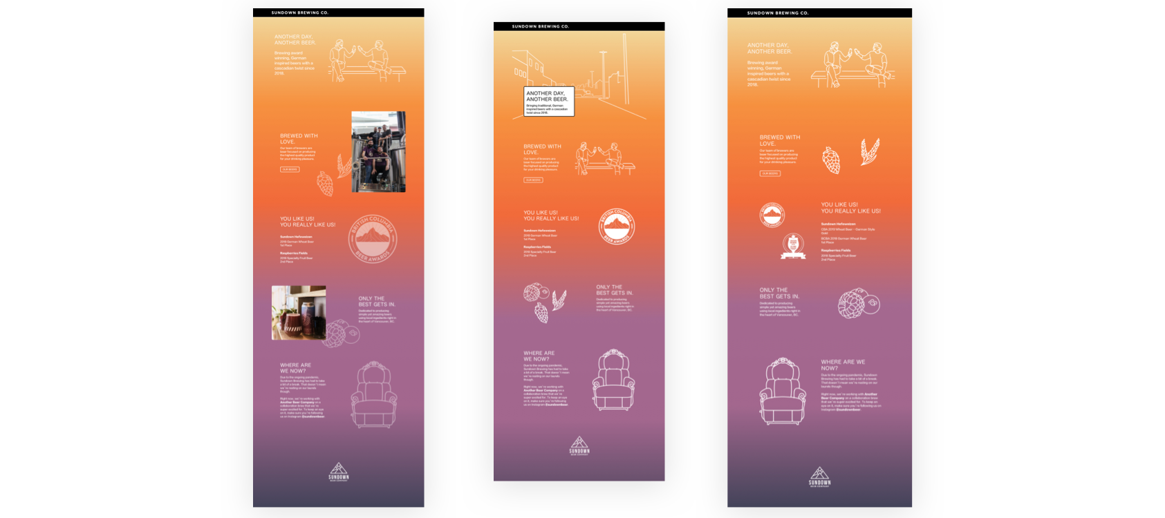
Refined mockups created while collaborating with the client over a video call

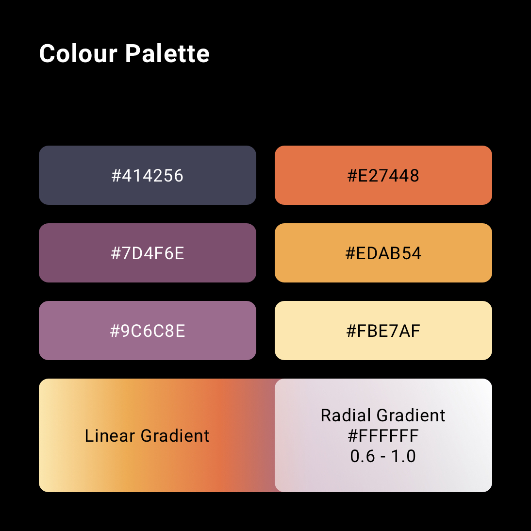
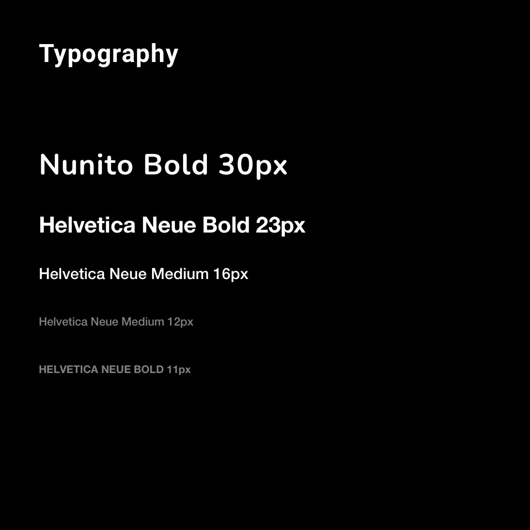
The new style guide is designed to consolidate and honour the original two styles and their designers.
While I kept the original colours, I put far more emphasis on them than the original website did. Now it's more in line with their existing beer can labels and adds a sense of consistency to the brand.
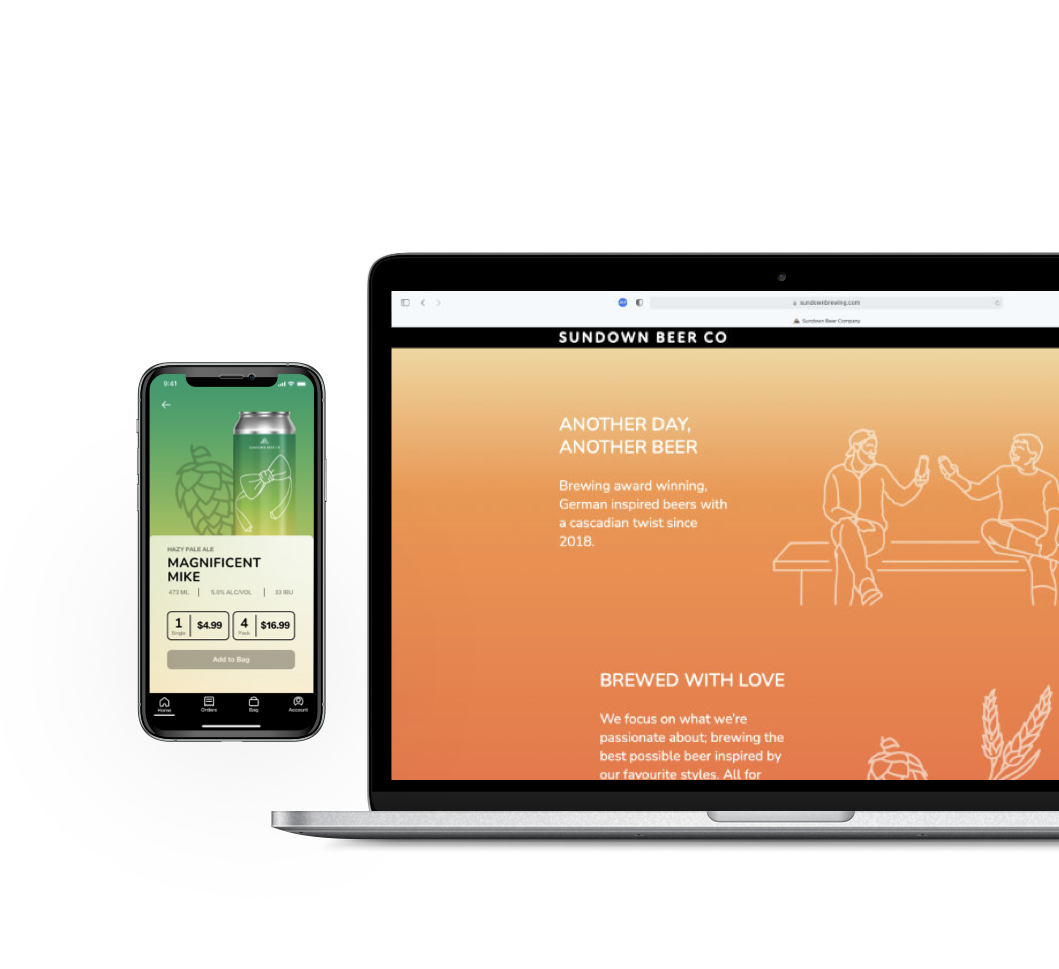
The final design leans heavily into both the white line art and colour gradients that Sundown is known for. This creates a unique and cohesive look that emulates a setting sun as the user scrolls down.
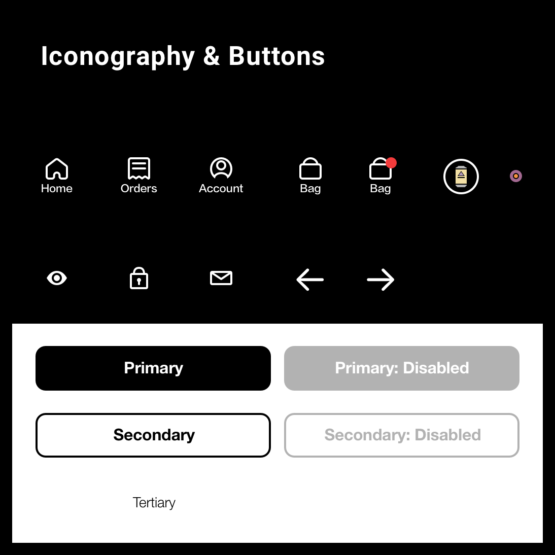
Using black for buttons and the navigation bar helps their call to action pop against the colourful background.
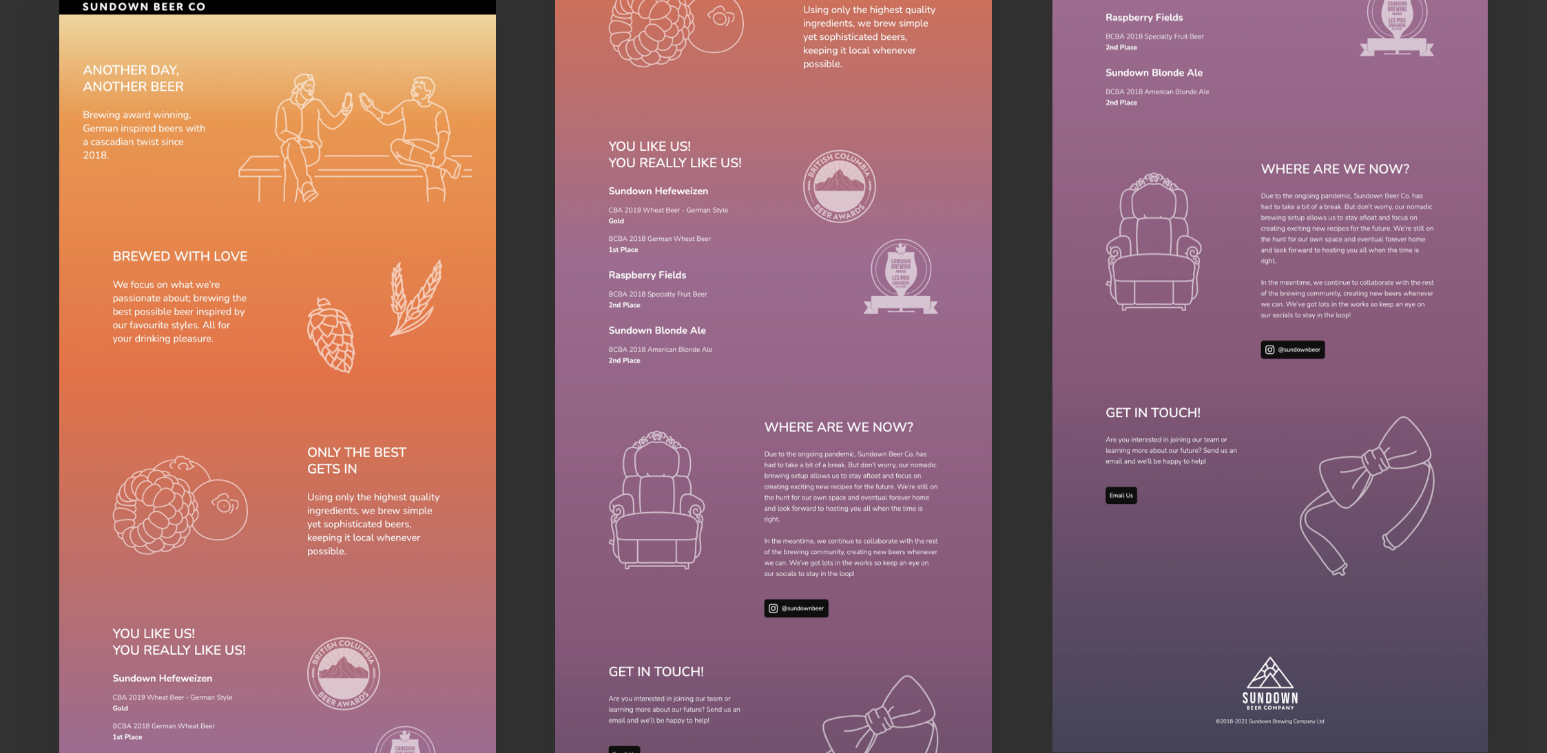
Final Design
As a personal project, I put together an animated mockup of different user flows for a hypthetical beer delivery service.
I wanted to embrace the colourfulness of the brand while still using white space to separate items. Stylized cards that blended into the can itself put both the beer and the product info front and centre.
One of the reasons I wanted to create a fictional mobile app is that I really enjoyed working within this style and wanted to see how far I could push it without the restrictions of having to code it myself.
You can watch the videos below, or check out the prototype yourself!
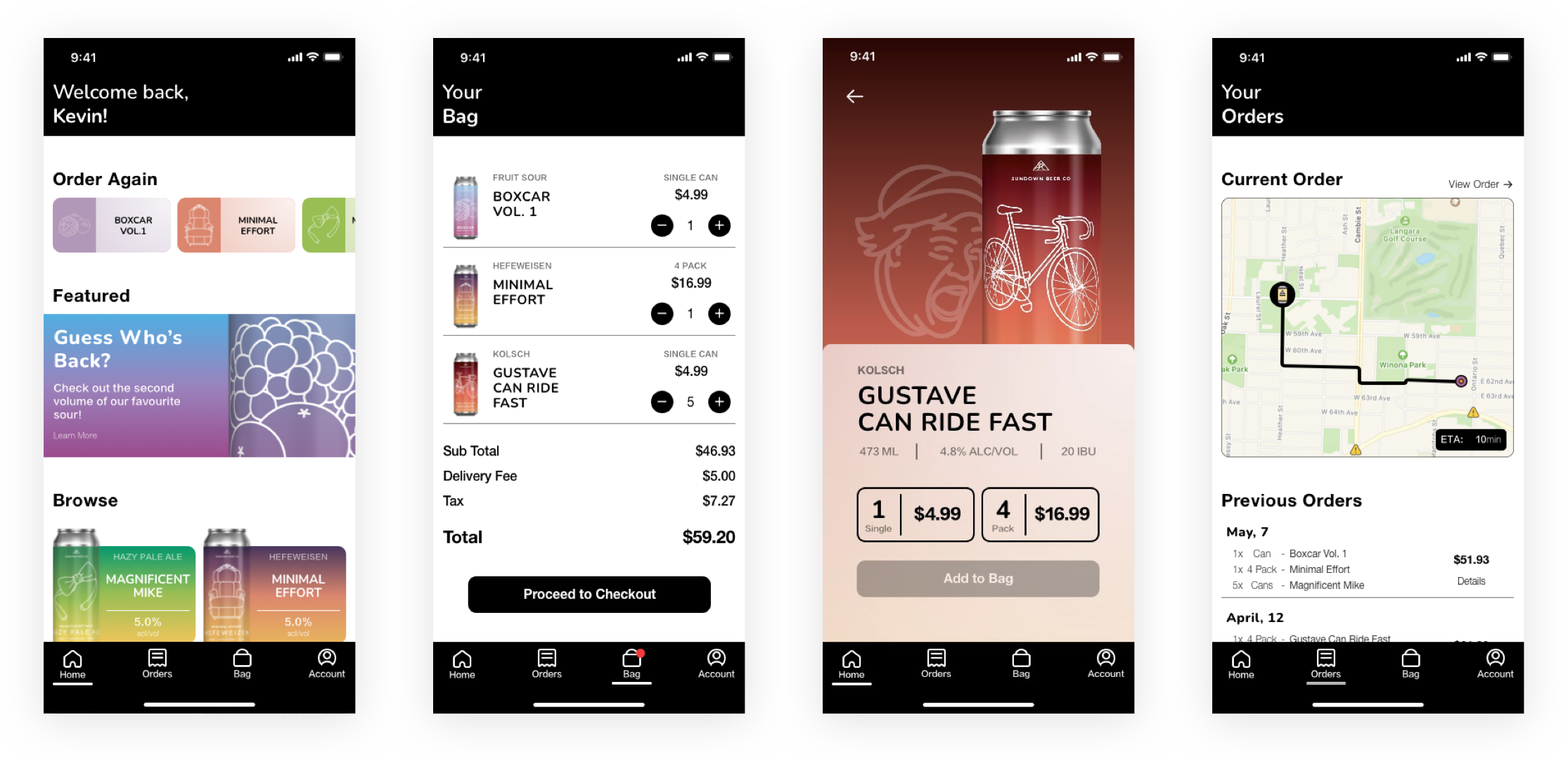
Mobile app screens
The client was very attached to a full screen gradient for their website. I was admittedly worried about the legibility. I’m glad I took the time to adjust when some of the colours blended and the content spacing though because the effect, while a user scrolls down, is honestly pretty nifty.
This is the first project where I was tasked with the design and the front end execution of it. As a result, I did find myself feeling a little restricted in what I felt I could do because I kept asking myself “Can I code this?”. The result is a fairly basic layout that relies a lot on the pop of colour, tone of the copy, and attactive line art.